Finding product-market fit for an app the company had written off
Platform
iOS, Android, Huawei
Role
Senior Product Designer
Date
2019
Overview
Yandex.Market is a price-comparison marketplace — people go there to weigh models, prices and sellers before they buy. Yandex reported over 17 million people using it every month. The mobile app was another matter: by 2019 the company had stopped maintaining it. We pitched a way back and won a small team of three — a product manager, an analyst and me as the only designer. I owned all product design through the relaunch. The result: daily active users grew tenfold against a 3× target, and new-user growth rose 40% after the relaunch.
Daily active users
3× target, 10× achieved
New users after relaunch
+40%
Problem
The app had been built as a mirror of the website: a thin native shell wrapped around a webview. It was chosen to cut development cost and keep mobile in step with web releases, and on those terms it worked. As a product it did not.
The architecture is the whole problem in one diagram — a search bar, a tab bar, and a web page in between:
Interaction speed suffered, people left, and revenue fell sharply month after month until maintenance stopped altogether. Both stores told the same story: ratings had sunk to 2.4 and 2.7. That was what we inherited — a product the company had already written off, sitting on a technical foundation none of us had the resources to replace.
Offline shoppers were already comparison-shopping — by walking
Yandex runs an in-house research lab, and I used it to work out who was actually on the service. One segment that mattered was mothers replacing worn-out household items, buying in the same categories over and over.
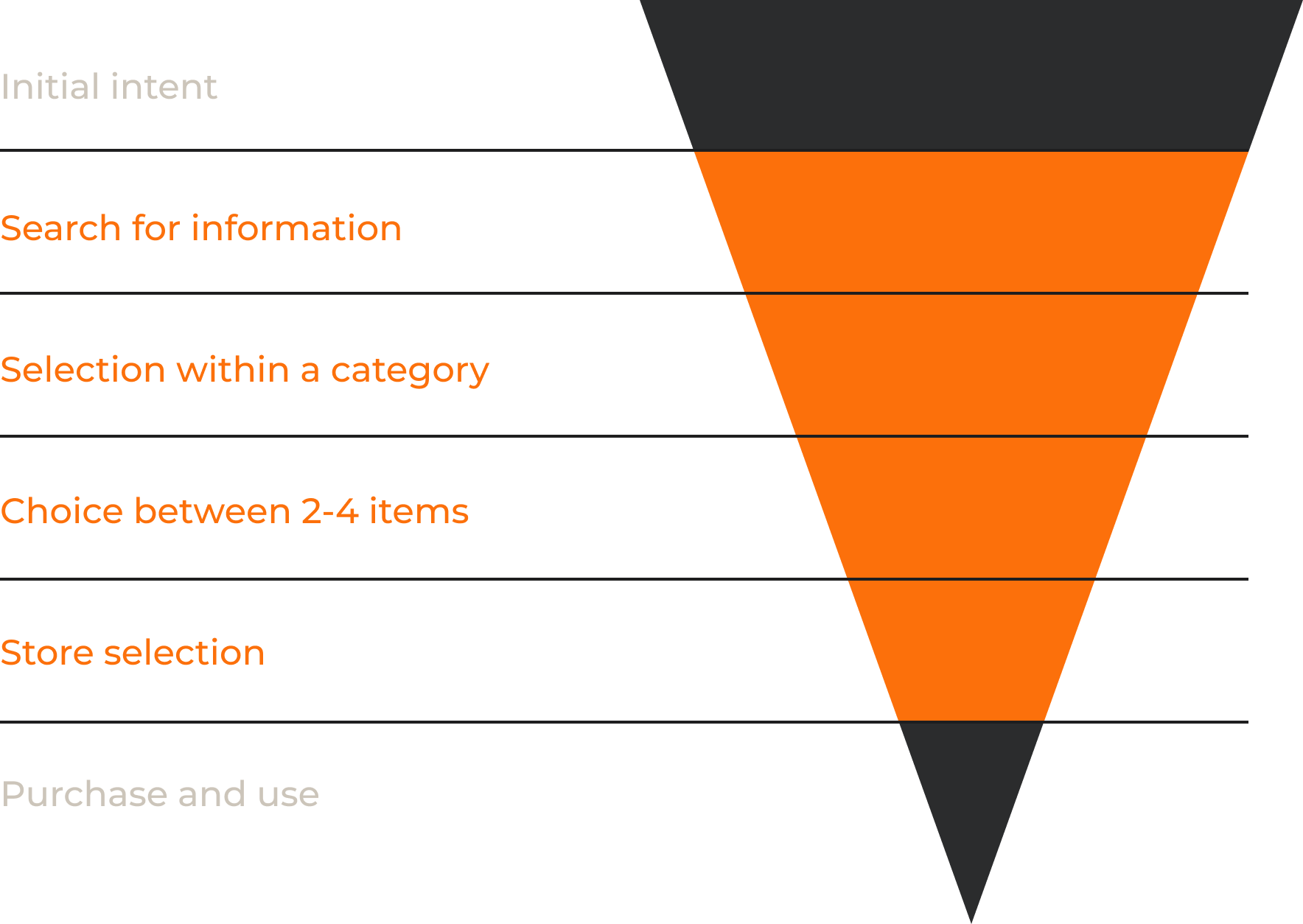
The research placed the product precisely: not the moment someone decides to buy, but the stretch in the middle where they compare, choose, and pick a shop:
The audience I wanted, though, was not on the service at all. Online commerce was still a sliver of Russian retail — independent estimates put it between 4 and 6% of everything sold, with PwC's figure at roughly 4% for 2018. Nearly all shopping still happened in physical shops. So I went to a shopping mall and interviewed people there: not our users, the people we had never reached.
What they were doing was our product's job, performed by hand. They walked from shop to shop with a model in mind, checking prices and specifications against whatever they had seen two shops ago. They were comparison shopping already — on foot, from memory. What lost — chasing the shoppers already online: the obvious move, and the crowded one. It would have left the people doing this work on foot exactly where they were: walking between shops, comparing from memory, with no reason to open our app.
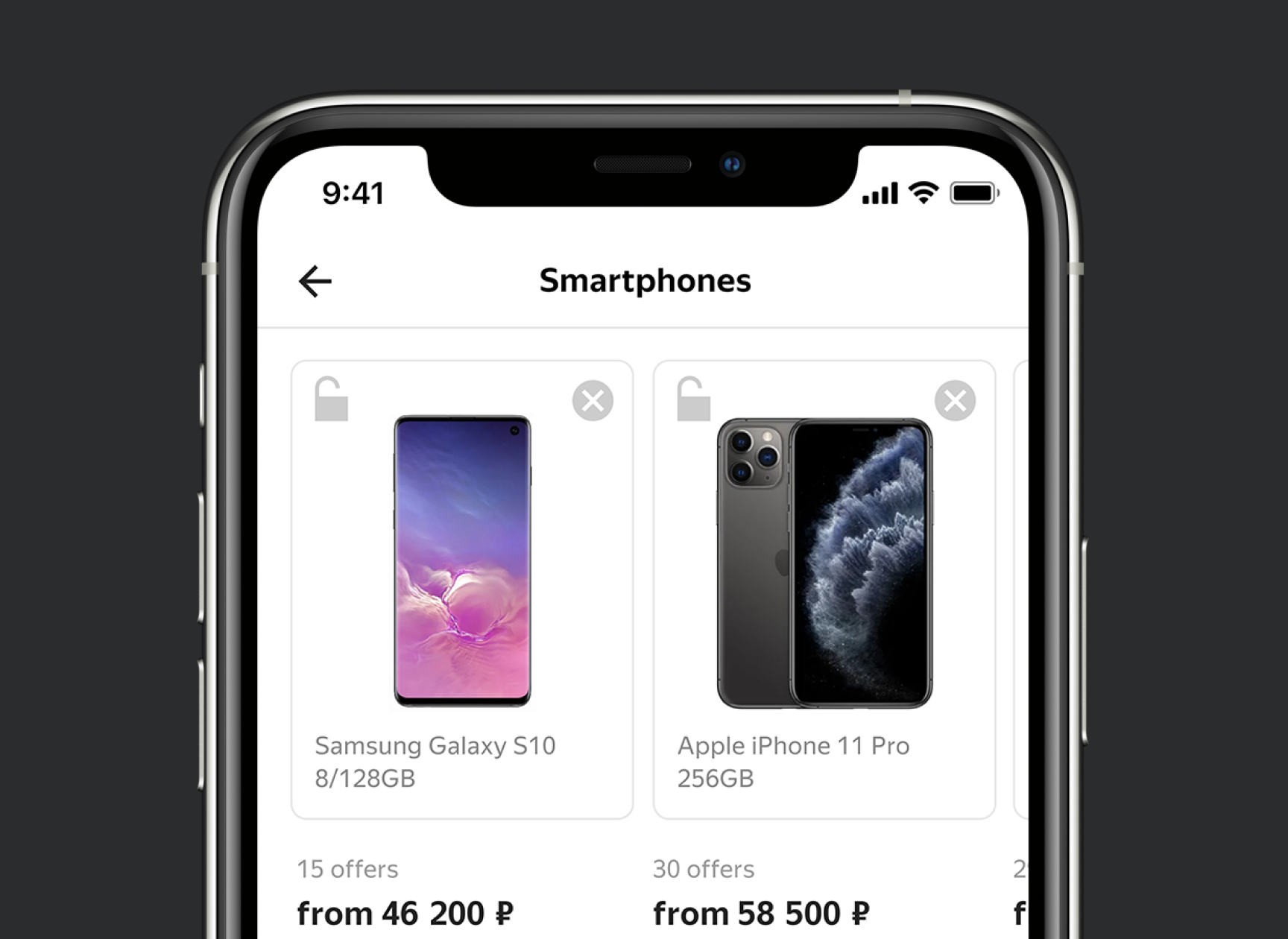
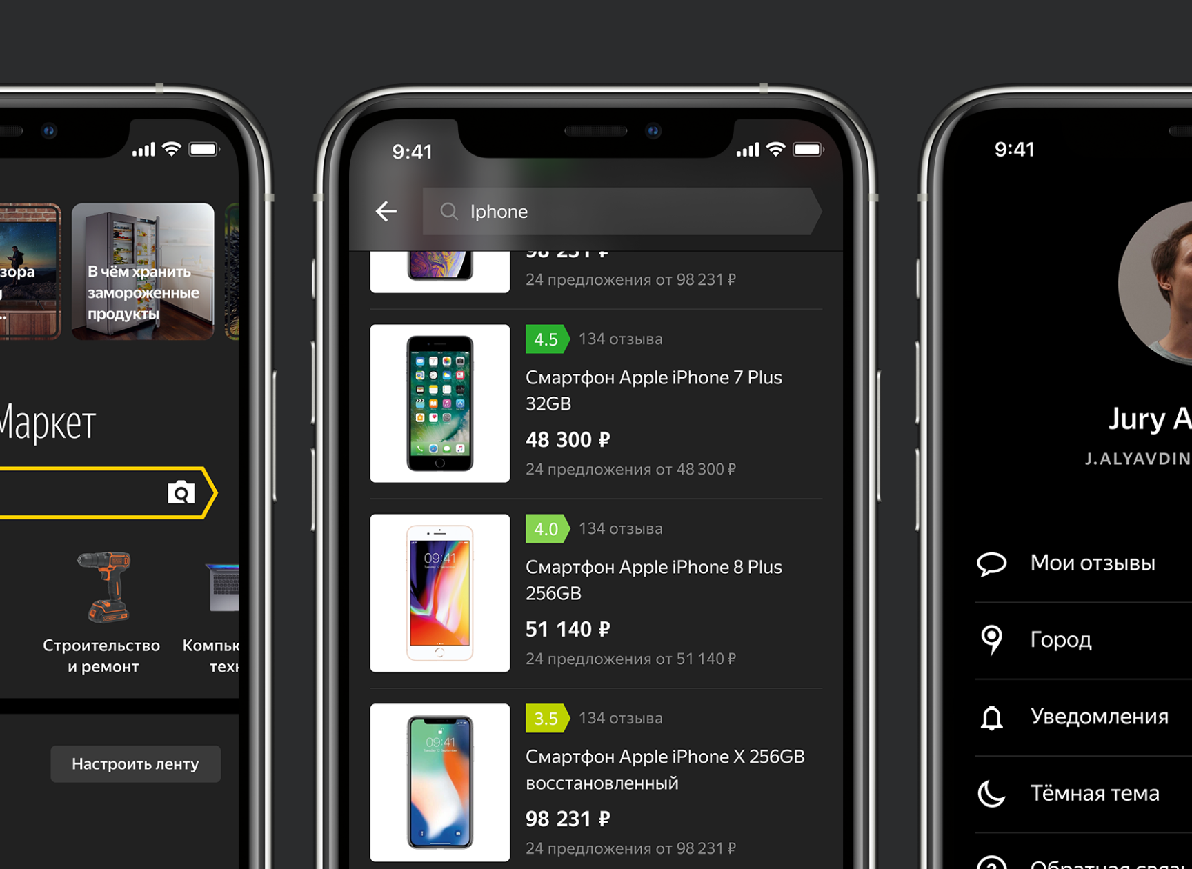
The comparison they were making on foot, as a single screen — models, offer counts and starting prices side by side:
A photo did the work the search box could not
The mall interviews kept snagging on the same thing. People knew exactly what they wanted and could not type it. One shopper put it roughly this way: I know what I want, I just don't know what it's called. A search box is no use to someone holding a worn-out object whose model name they never learned.
So I put a camera where the search box had been — photograph the thing itself, or its price tag, or its barcode, and let the app do the naming. What lost — better search and a richer catalogue: the safe spend. It would have sharpened a tool that had already failed these shoppers, and it would do nothing for a person who cannot name what they are holding.
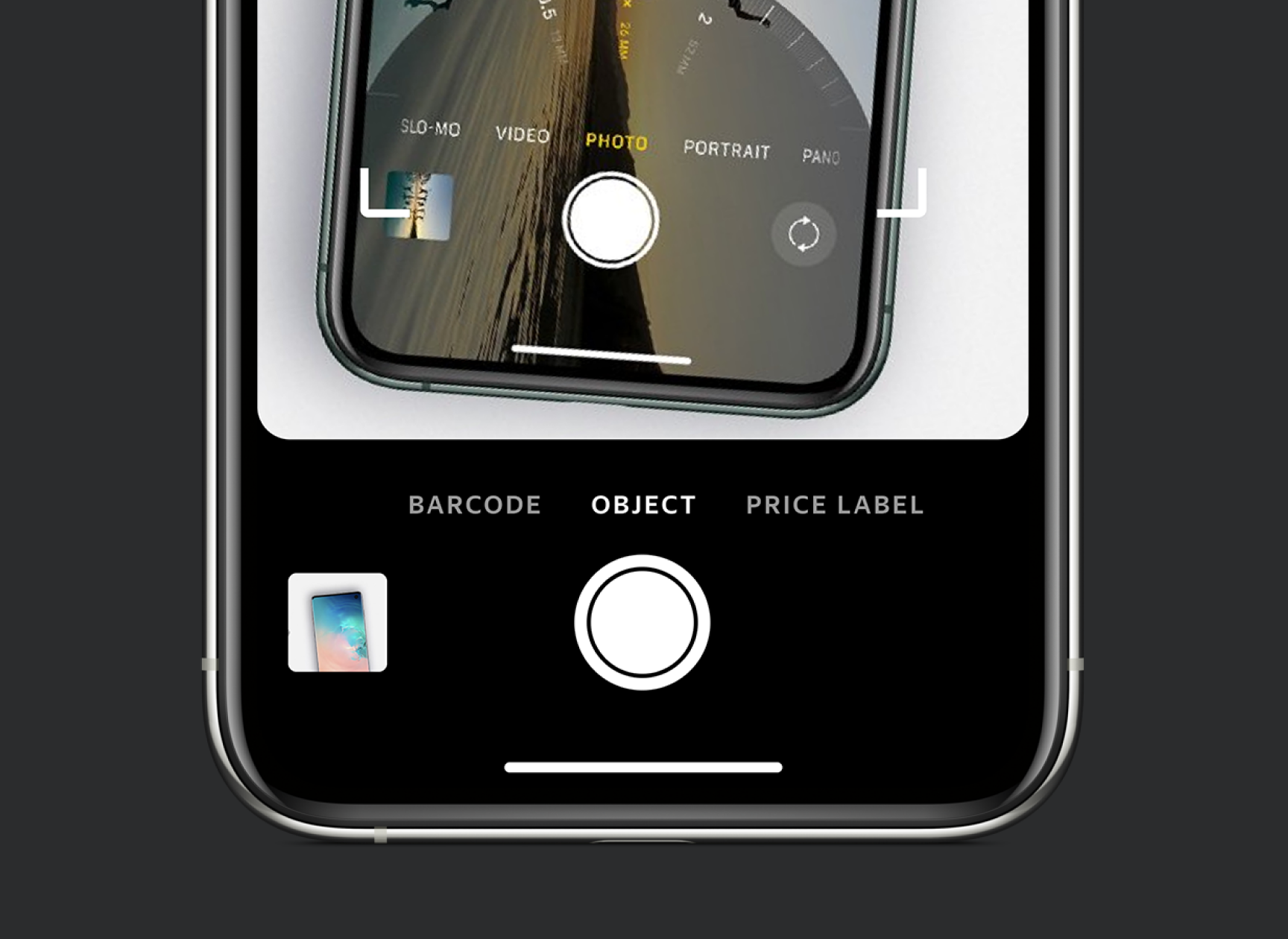
The capture screen offers the three things worth pointing a camera at in a shop — a barcode, the object itself, or the price label:
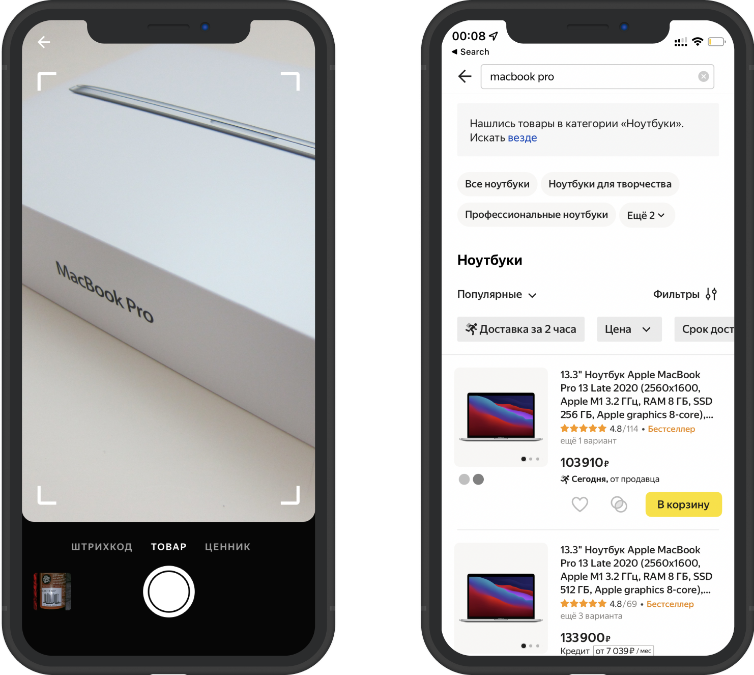
Point it at a product and the app returns the category it recognized, with offers ready to compare:
The limitation was inside the bet from the start. Image recognition in 2019 could tell a laptop from a kettle, but not which laptop — and replacement buying is precisely the case that turns on the variant, the model, the size. So the design handed off deliberately: recognize the category, then put the comparison right there and let the person finish the identification themselves.
In the shipped app the camera sits in the search bar rather than behind a menu — the bet went to the primary entry point:
And in the shops themselves, the behaviour the bet was built for — a phone pointed at the thing on the shelf, which comes back as a card with a price:
Outcome
Target versus result: we set out to triple daily active users. They grew tenfold. New-user growth rose 40% after the relaunch, and store ratings recovered from 2.4 and 2.7 to 4.7.
Store ratings
2.4 and 2.7 → 4.7
Daily active users
Tenfold, against a 3× target
Nothing clever moved the ratings: a genuinely better product replaced a broken one and the reviews followed. The mandate changed with it. Mobile went from a project the company had stopped funding to the center of its e-commerce strategy, the team grew from three of us into a department, and the branch's revenue grew several-fold as it became the nucleus of the whole e-commerce unit.
The trade-off: the signature bet worked well for some categories and poorly for others. Photograph the right kind of object and the app was faster than any search; photograph the wrong one and it returned a category and little else, leaving that person back at the search box they could not use in the first place.