Platform
iOS, Android
Role
Founding Product Designer → Design Lead
Date
2021–2023
Impress runs its own chain of orthodontic clinics across Europe, straightening teeth with clear aligners instead of braces — more than 50,000 patients as of 2023. Everything happened in a chair, including a check-up every fortnight for the length of the treatment. There was no patient app. I proposed one, argued its economics, and designed it: I was the company's first product designer and the only one on the project at the start; the call centre ran the interviews, the orthodontists held the veto over anything clinical. The result: the first version shipped in three months, took the fortnightly check-up out of the clinic, and is still live largely as designed.
Origin
Proposed, not assigned
First version
Shipped in three months
Then
A release every fortnight
Adoption
Most patients within six months
Impress is a physical service before it is a digital one — its own clinics, its own chairs. That is why an app was a business case to argue rather than a feature to request:
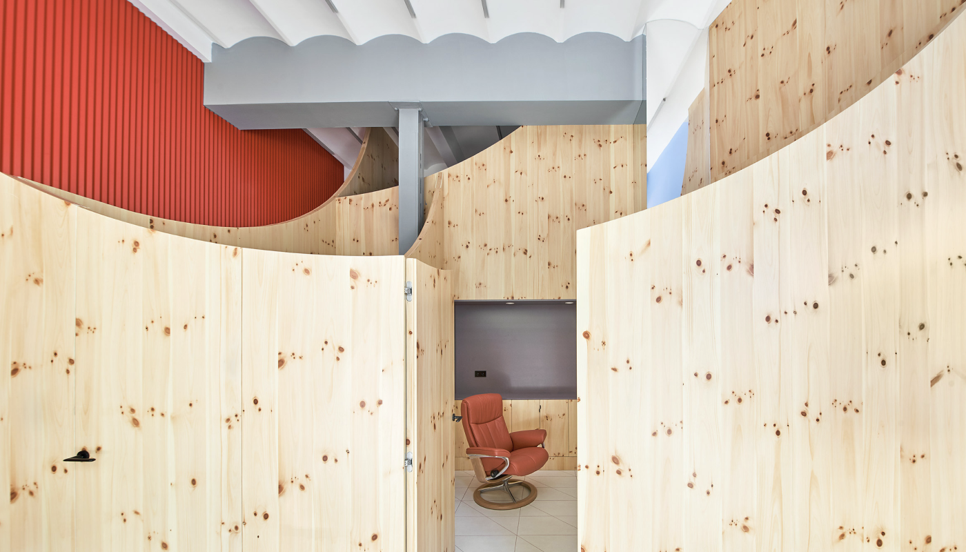
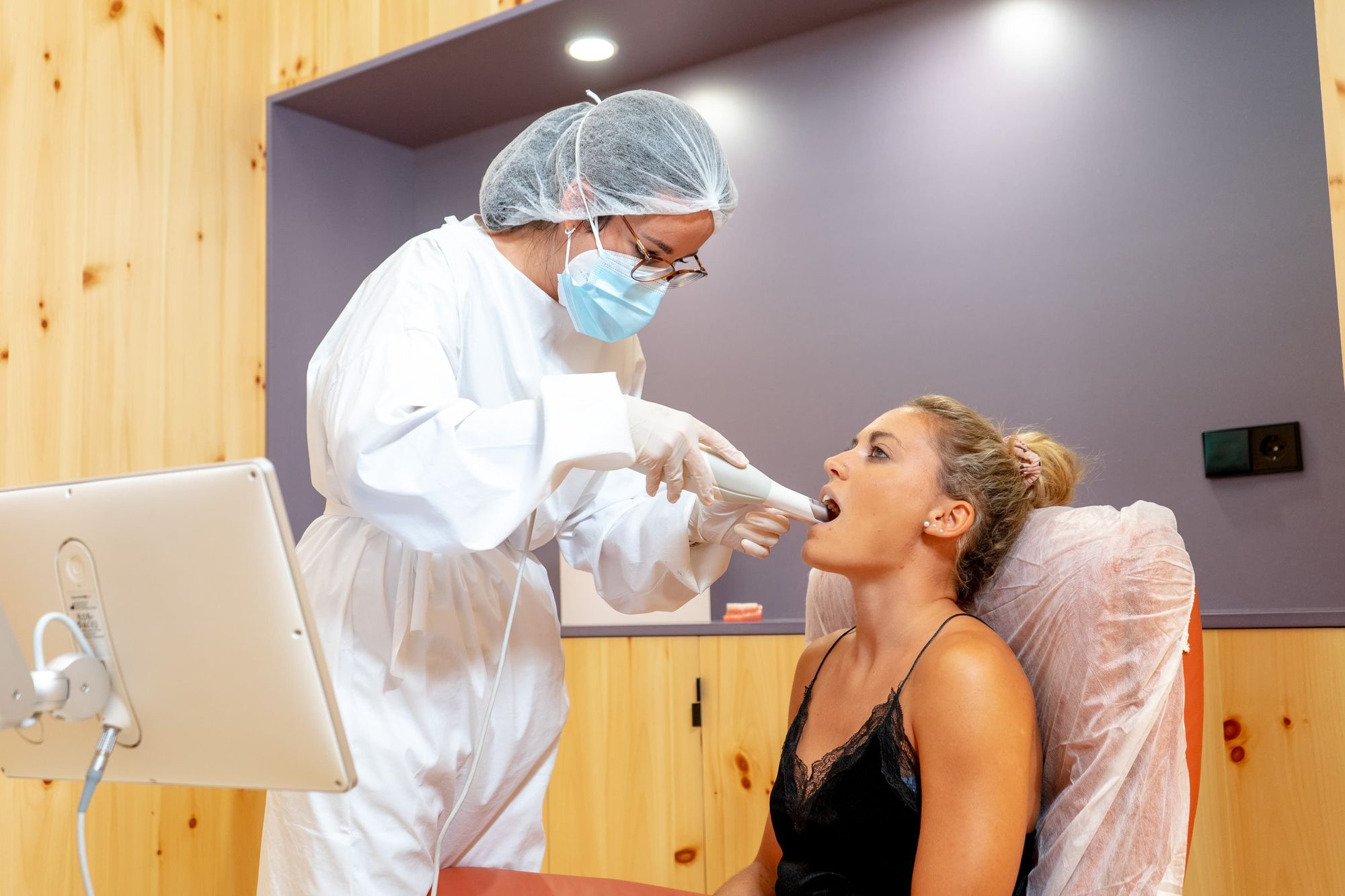
Treatment runs in fortnightly steps — Impress said patients could typically see results in as little as six months — and each step needs a professional to confirm the teeth have actually moved before the patient switches to the next aligner. In practice that confirmation meant a clinic visit. Once acquisition and clinic overheads were counted, a single appointment cost the company tens to hundreds of euros, and clinic capacity was being spent on visits that lasted minutes. Patients paid in time. As one put it, roughly: I can't take a day off for five minutes in a chair.
Nobody asked me to fix this. I put the case together myself — what the recurring visit cost, what removing it would be worth, and what would have to be true for a clinician to accept it — and proposed an app before there was one to design.
This is the appointment in question — a clinician, a scanner, and a chair, repeating every fortnight for the length of the treatment:

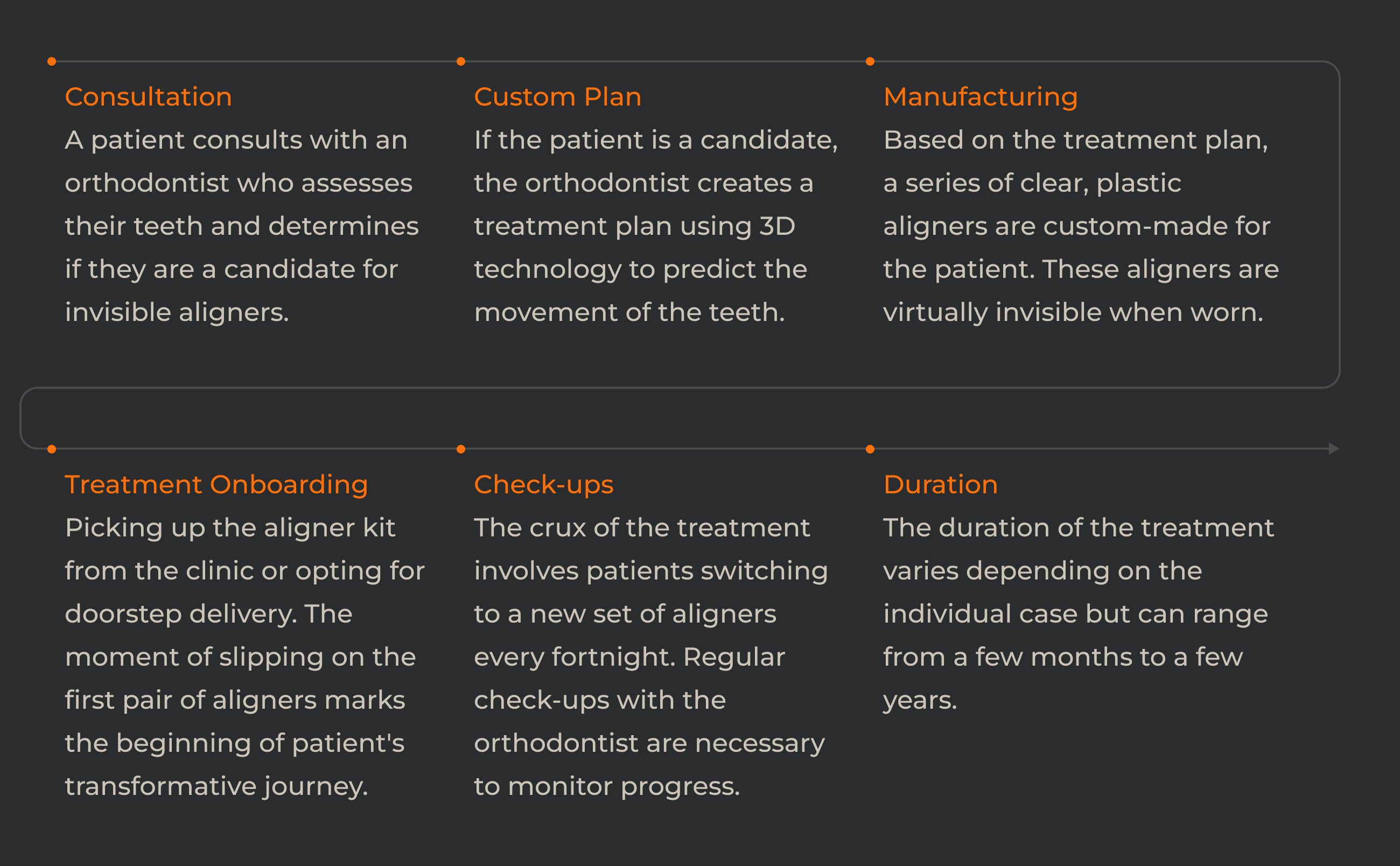
Consultation, plan, manufacturing and fitting happen once; the check-up in the middle repeats for the length of the treatment:
Open full sizeI wrote a structured interview script and the call centre ran it live with existing patients, on the phone, in Spanish. Five things came back consistently: the fortnightly check-ups disrupted people's schedules, waiting rooms ate time even with an appointment, patients wanted to watch their own progress, they were unsure when they were allowed to switch aligners, and booking was harder than it needed to be.
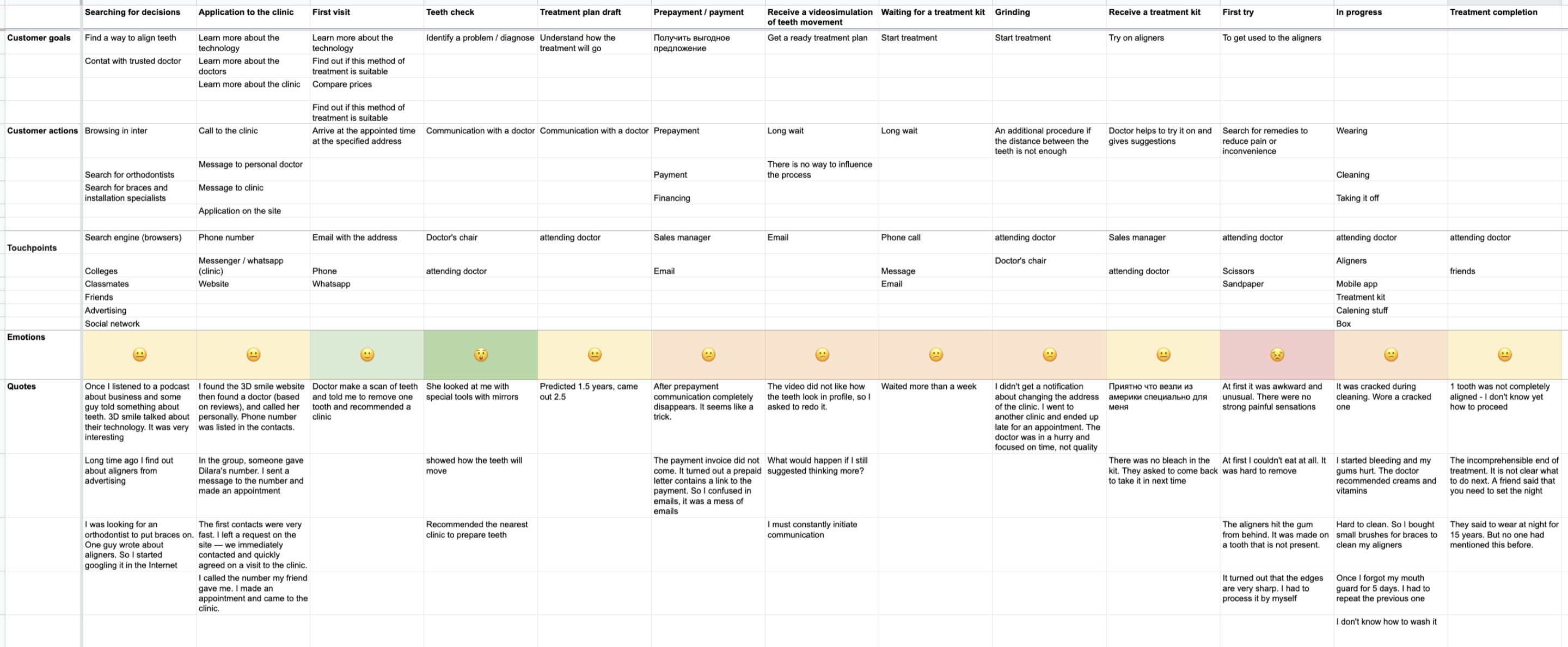
Mapping the treatment stage by stage gave those complaints a shape — pain at every step from the first visit to the final fitting, with the recurring clinic visit running through all of it:
Open full sizeFour of those five described friction around the visit; only one was the visit. Booking, waiting rooms, messaging and progress anxiety would each have made the same treatment easier to sit through, and none of them would have removed a single appointment. I had three months, and I had argued the case on what that appointment cost — so the first release shipped one loop and nothing else: capture a photo good enough for a clinician to judge, get it reviewed, and log the wear time that made the judgement safe.
What lost: shipping the whole patient journey at once. Kit tracking, onboarding, a messenger and a new booking flow, all in one release — the complete-product launch, and the plausible call, because most of that list came from a patient. It would have put months between the argument I had made and the first appointment it removed, and it would have spent them without knowing whether a clinician would accept a photograph at all.
The deferred half shipped later, driven from the console the clinicians worked in: the treatment plan is authored there — how many steps, how many days each, which ones still need an in-clinic procedure — and the patient's app follows it.
Letting patients photograph their own teeth for a clinician to review remotely was the obvious shape. The orthodontists' objection was not about tooling. Their licence rests on what they can assess, and as one of them put it, roughly: I can't sign off on what I can't examine.
What lost: live video consultations. A scheduled call with the orthodontist was the other credible remote model, and the one telehealth had already proven elsewhere — but it puts the appointment back into both calendars, it scales exactly as badly as a chair does, and a video stream does not give a clinician the thing they compare: a still, at a fixed angle, with the cheeks held back, set against the same shot from a fortnight ago.
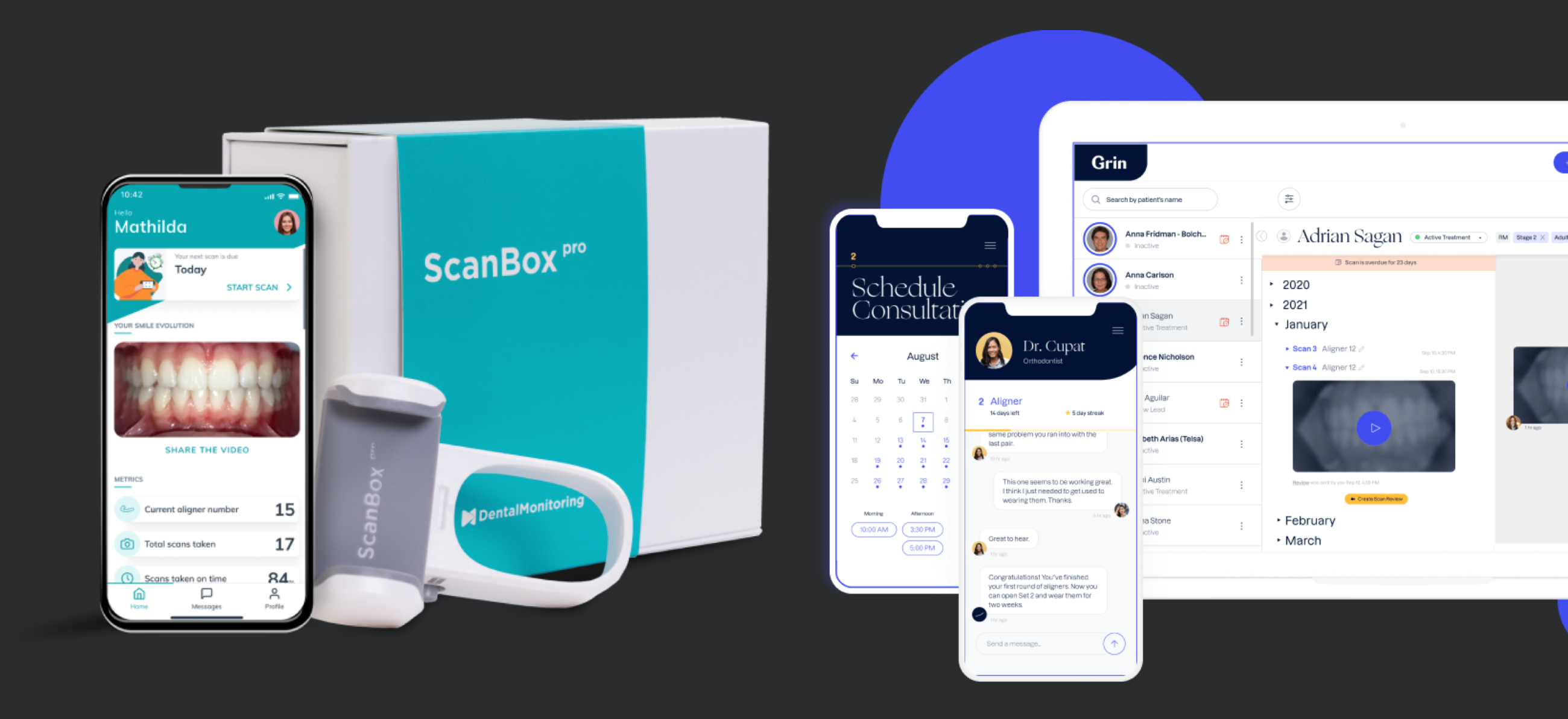
Benchmarking the field showed how hard that shot is — the established remote-monitoring products ship a moulded plastic retractor whose only job is holding it steady:
Open full sizeThat made the photograph the design problem. A clinically usable photo needs specific angles, a cheek retractor held in place, and enough light — taken by an untrained person, in a bathroom, on a phone. A picture that misses those is worthless to the clinician reviewing it, however good the software around it is. So the app's real job was teaching capture: a guided sequence, one shot at a time, that a patient could get right on their own, first time.
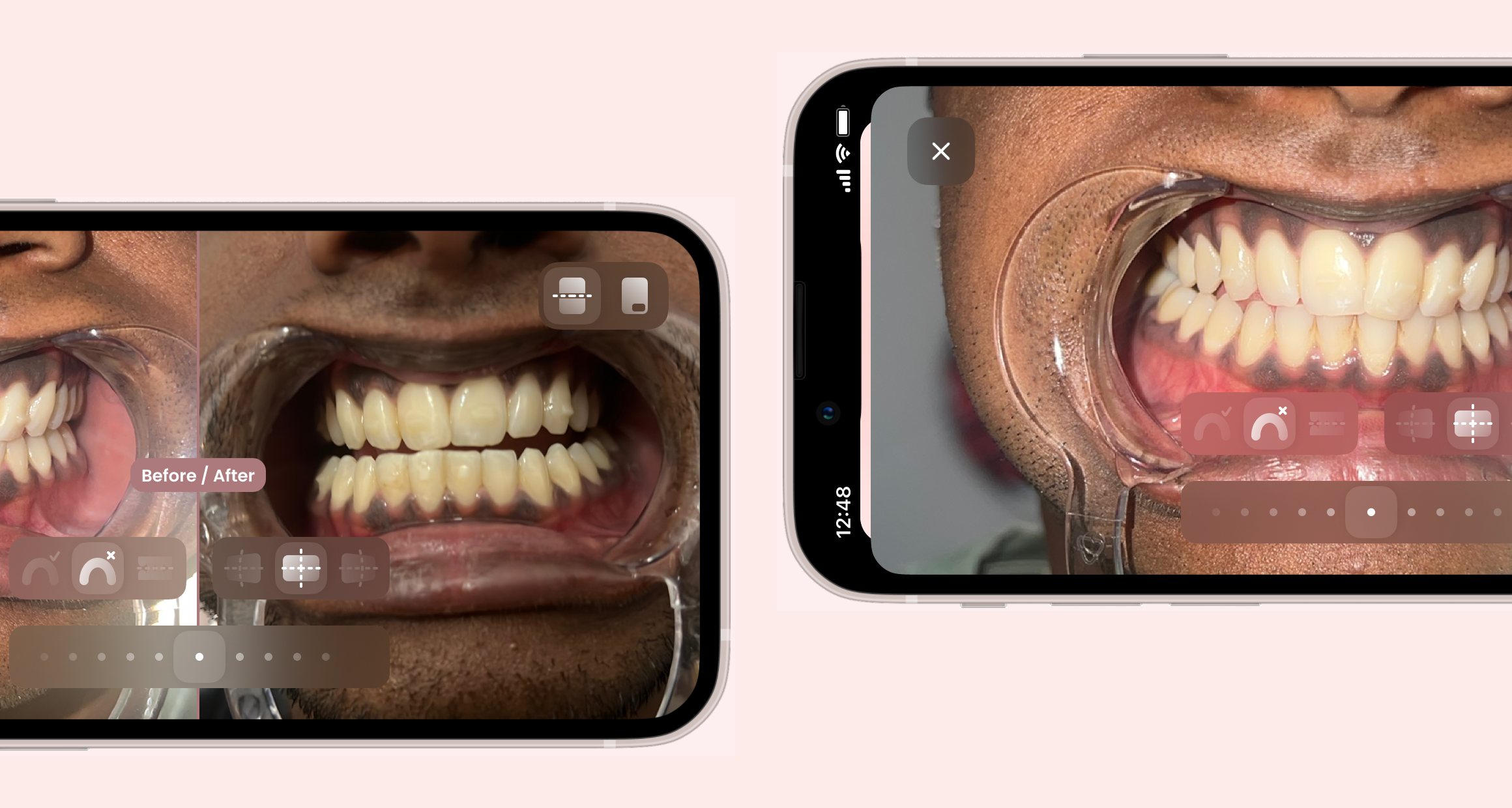
The capture flow walks through each shot the clinician needs, then plays it back against the last one:

Watching patients test the prototype is what settled the guidance: a retractor in one hand and a phone in the other leaves nobody free to read instructions, so every prompt had to survive being glanced at:
Onboarding had to teach the retractor before it could teach the photo — so when it arrived in a later release it led with the kit, modelled in 3D and animated from the angle a patient actually sees:
With photos arriving reliably, a cheaper design came within reach: let the app judge the images and tell patients when to advance. It would have been faster for the patient and cheaper for the company, and it is what a pure software product would have done.
What lost: letting the app advance patients on its own. A wrong call about tooth movement is a clinical harm, not a poor experience, and nobody on the clinical side was going to take that on.
So every transition waits on a clinician. The patient uploads, the orthodontist reviews, and only then does the next aligner become available. Patient photographs are health data — special-category data under GDPR Article 9 — which set the terms for moving them from a phone to a clinician's screen.
The other half of the loop was evidence. Aligners only work if they are worn around 22 hours a day, the standard clinical protocol, so the app logs wear time and reminds patients — giving the reviewing clinician something firmer than recollection to go on.
Two rounds of testing with existing patients shaped it, and the second is where the request for personal progress tracking came from. The daily log is what answered it, and it does double duty — the patient watches their own streak, the clinician gets a wear record instead of a recollection. Shown here as the app stood in 2023, many releases on:
Shipped in three months, then every fortnight: a large share of patients were on it within months, and most were using it within six. Taking those appointments out of the clinics produced net savings in the low hundreds of thousands of euros a year once development costs were counted, and the app was well rated on both stores.
The check-up
Clinic chair → phone camera
Clinic capacity
Spent on treatment, not confirmations
Cost per visit removed
Tens to hundreds of euros
Operating cost
Net savings, low hundreds of thousands of euros a year
That result paid for everything I did afterwards. An app that removed a recurring cost made the argument for design as a function rather than a service: the back-office suite the clinics ran on followed from it, and so did the design team I built and led. In July 2022 Impress raised a $125 million Series B — company context rather than the app's doing. Figures from Impress's internal reporting are given directionally here.
What it cost: the patients who most needed a chair. The workflow was built around the common case, and treatments that genuinely needed hands-on assessment were served worse by a process designed for a photograph. Catching those cases early, instead of waiting for a clinician to spot them at review, is where I would start if I picked this up again.