Platform
Web
Role
Product Designer
Date
2023
Nobody at Idealista asked for this redesign. I made it in 2023 as a self-directed project during a job search: the research, the information architecture, and the UI are all my own work. The brief I set myself was narrow: make the interface feel like the Idealista brand without making the property search any slower. The concept never shipped and was never going to. But it did what I built it for — it started hiring conversations.
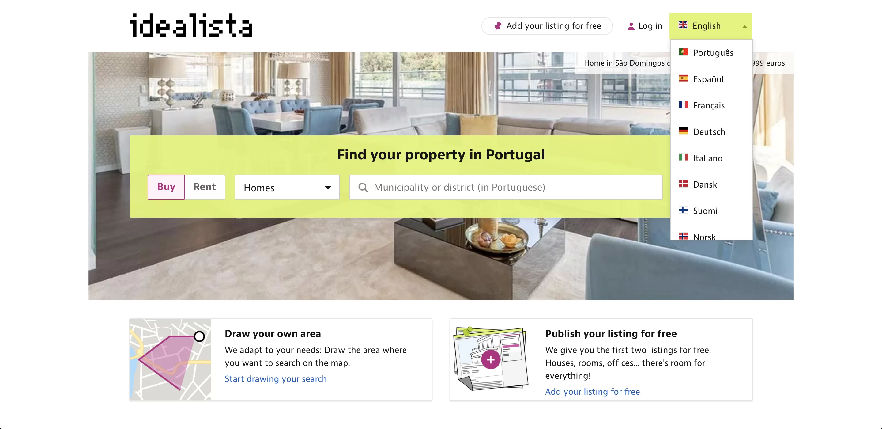
The brand had more character than the product let on. Idealista's identity is distinctive — the pixel wordmark, the lime green — but the 2023 interface read as generic listings machinery. The homepage was a search box over a stock photo. It greeted a first-time visitor and a daily searcher with the same screen.
The trap is the obvious fix. A brand-led visual refresh is what a distinctive brand invites, and it taxes exactly what a search tool must protect: speed. Expressing the brand and keeping the search fast pull in opposite directions, and reconciling them is the whole project.
The live site at the time made the case on its own — the brand reduced to a colored bar and a stock hero:

I kept the research honest and small: four to six people I knew who were mid-search, plus property viewings I attended in person alongside agents. Informal by design — enough contact with the real thing to be corrected by it.
It corrected me fast. One searcher put it roughly this way: if you don't call within the hour, the flat is gone. At one viewing, the agent walked a whole group of candidates through the flat at once, and decisions had to happen on the spot — there was no taking it home to compare. And in Spain the listed price is only the opening number: agency fees and deposits sit behind it, so comparing listings line by line misleads as much as it informs.
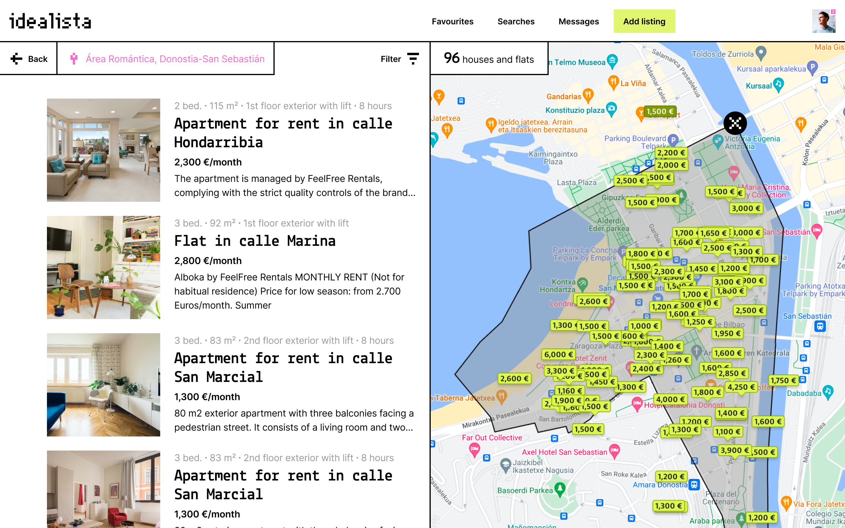
A search that works like that needs orientation more than volume. The results page fuses a permanent map with a compact listing column — the pairing Airbnb had already proven — so every result stays anchored to its place in the city. The alternative I rejected was the classic full-width list. It fits more flats per screen, but each one shows a price you can't fully trust in a location you can't see.
In the concept, the map never leaves the screen and prices sit where the flats actually are:

My first pass went the other way. I built out deep filtering — more controls, more precision — then dropped most of it once I realized people don't compose careful queries. They scan and react. The interface had to reward scanning: one row per flat, calm columns, the deciding facts where the eye lands first.
That call settled the brand question too. Photography is the default way to express a brand this visual, and photo-led cards cost exactly what the race can't spare — listings per glance. So the brand is expressed through structure instead: Idealista's lime and its blocky monospace type, set in dense, quiet layouts. I kept the product's identity and restructured the path through it; a full visual overhaul would have read as a new skin on the same confusion. Contact actions got the same restraint: they sit on the listing, where deciding happens, and stay out of the way while people browse.
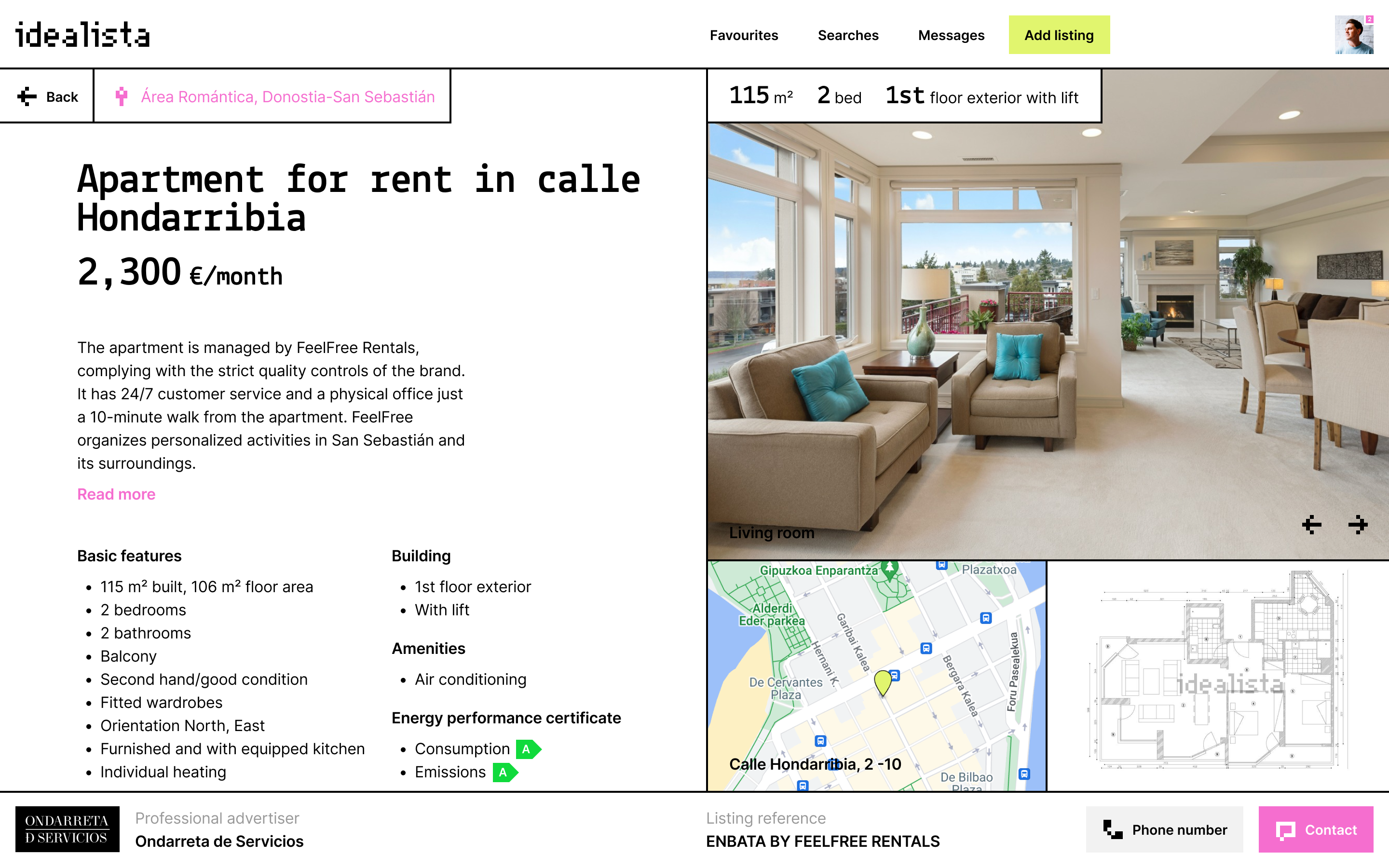
The property page moves what a decision needs — price, specs, floor plan, location — into the first screen:
The brand does the work a hero photograph usually does:
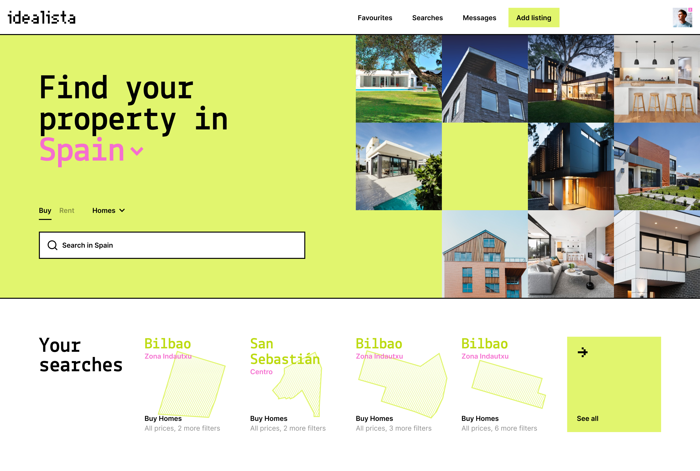
The homepage also stops treating everyone the same. A first visit gets an explainer of what Idealista is; a returning searcher gets saved searches and fresh picks first.
Both variants exist in the concept — one introduces the service, one resumes the search:
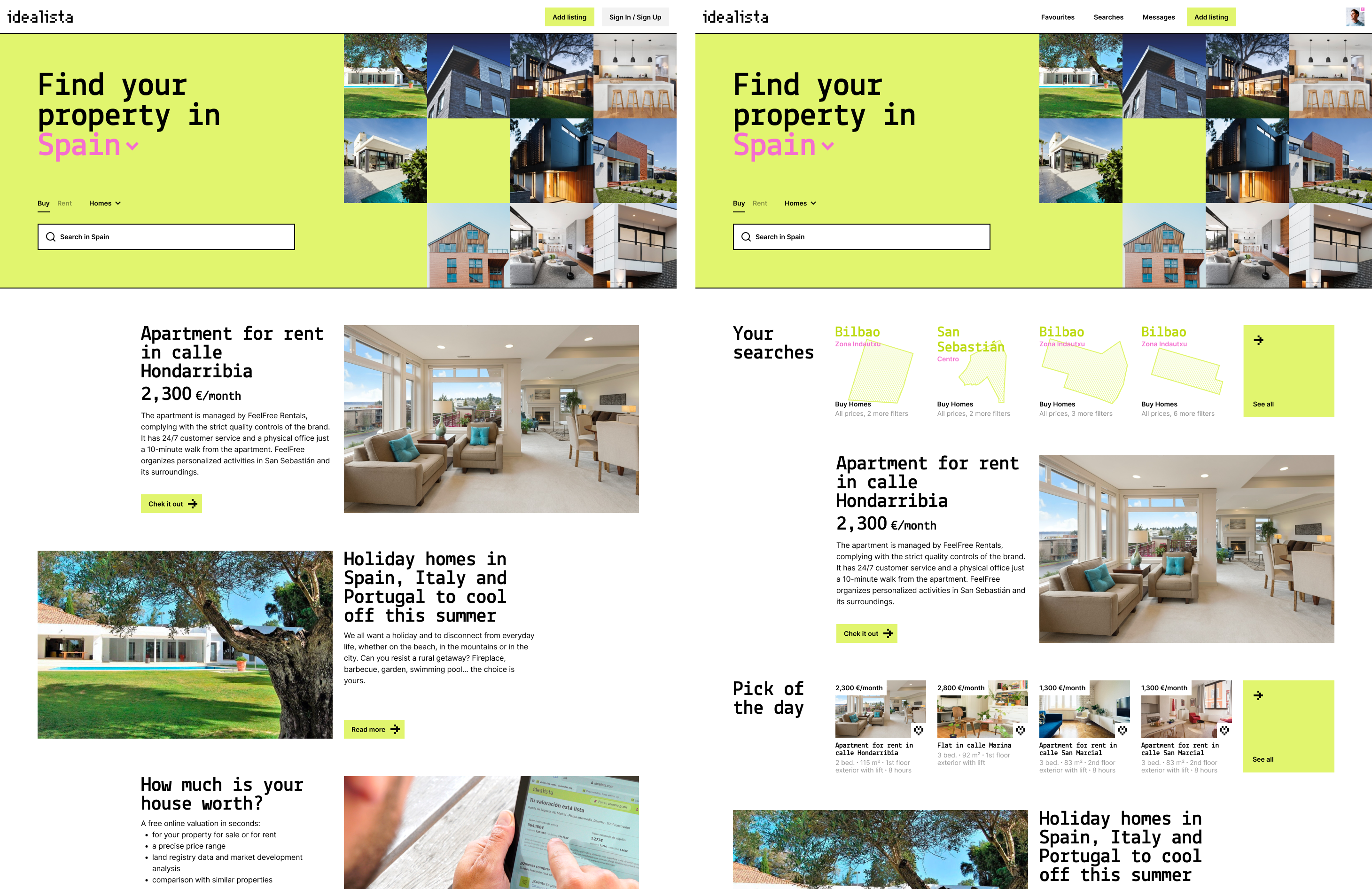
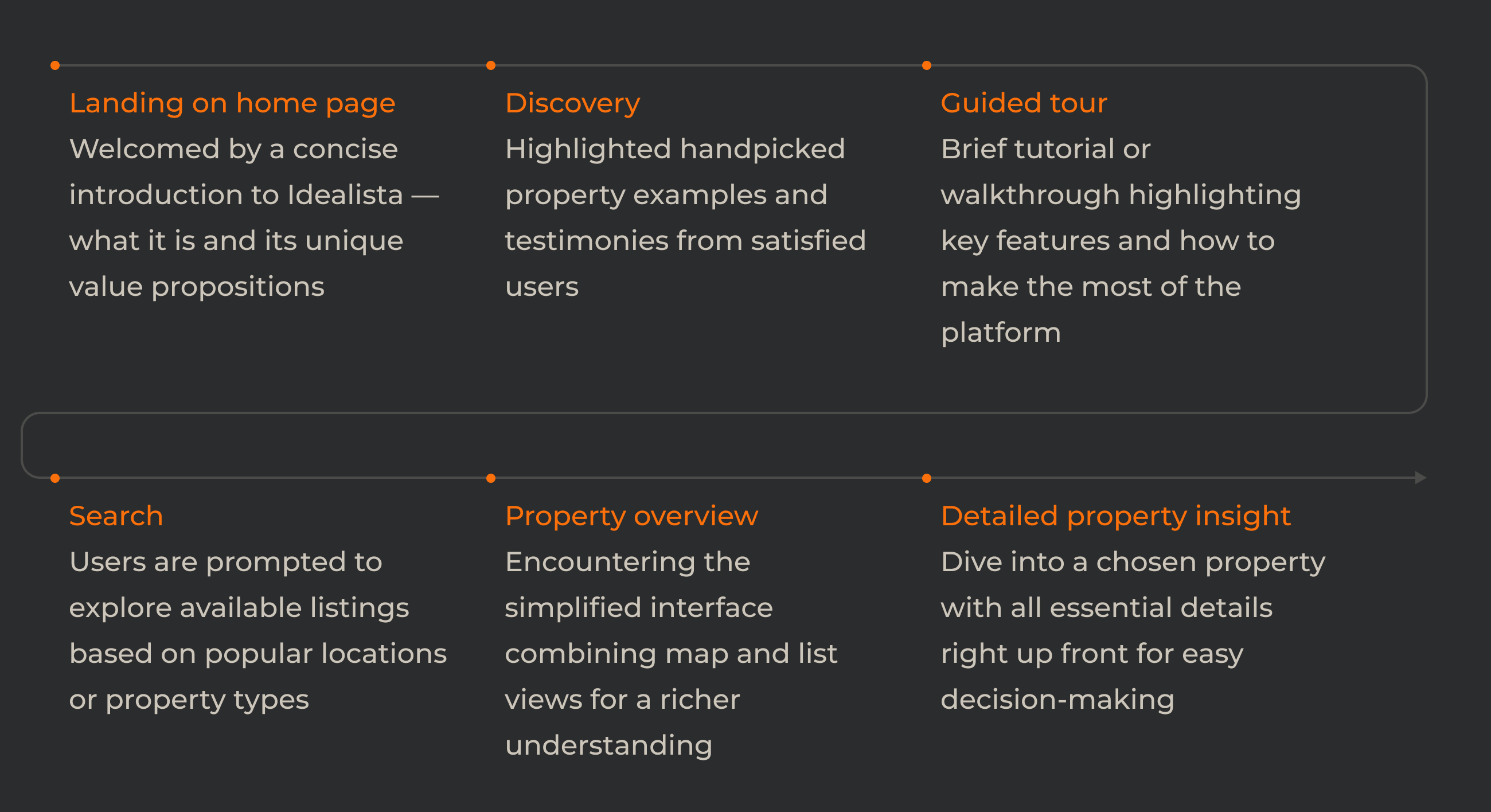
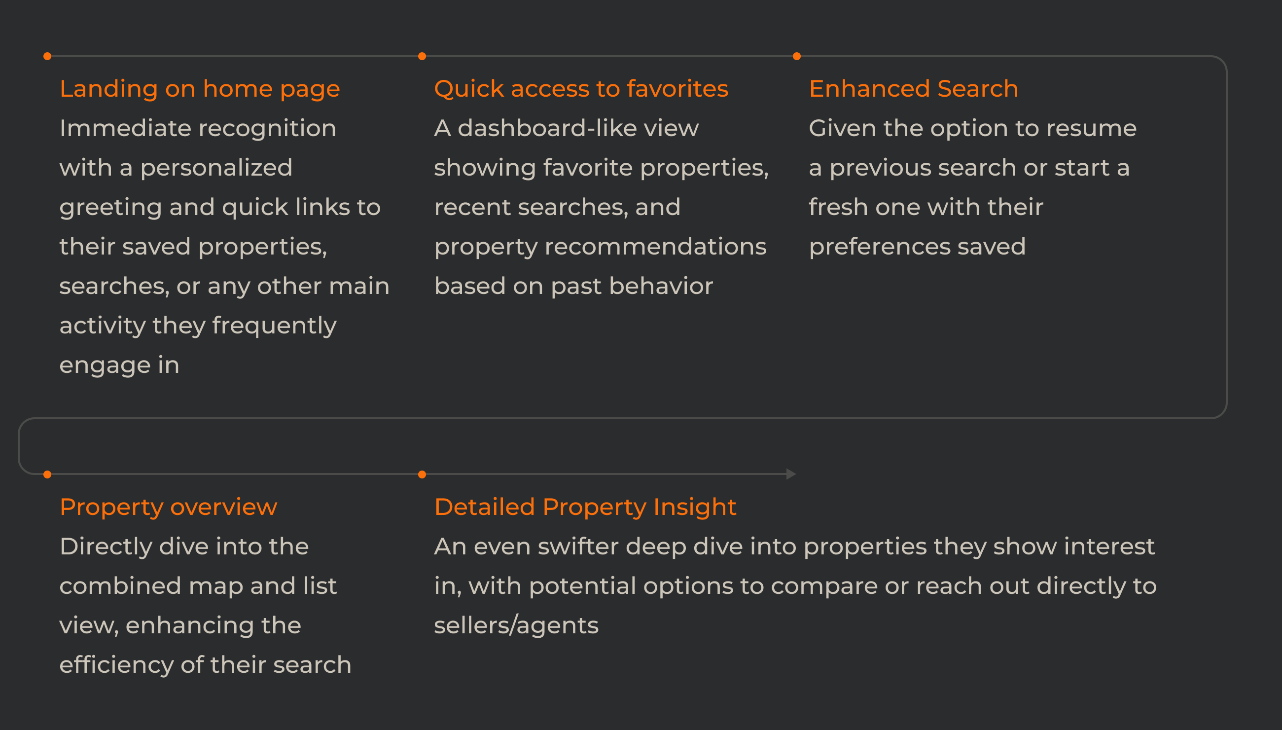
Those two homepages are the visible end of two paths I laid out separately. A newcomer has to be told what Idealista is before being asked to search; someone mid-hunt has already answered that question and wants their last search back.
The first-time path spends its early steps explaining, and only then puts the person into a search:
Open full sizeThe returning path skips all of it — saved properties and recent searches are the landing screen:
Open full sizeFramed honestly: this is a self-directed concept. Nobody commissioned it and it never shipped. What it proves is the argument itself — a brand can be expressed in structure, color, and type without taxing a search that behaves like a race. As a portfolio piece it did its job and started the hiring conversations it was built for.
The trade-off I would name first: the permanent map costs listing density. Every screen shows fewer results than a classic list would, and the squeeze is worst on small phones — which is where most searching happens. If I came back to this, that tension is where I would start.